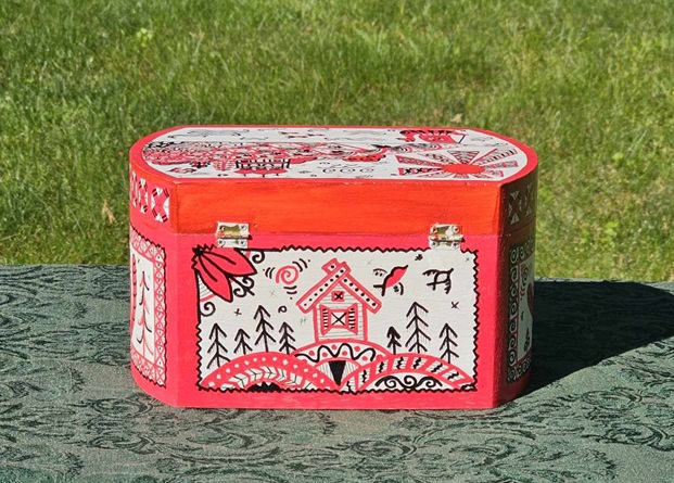
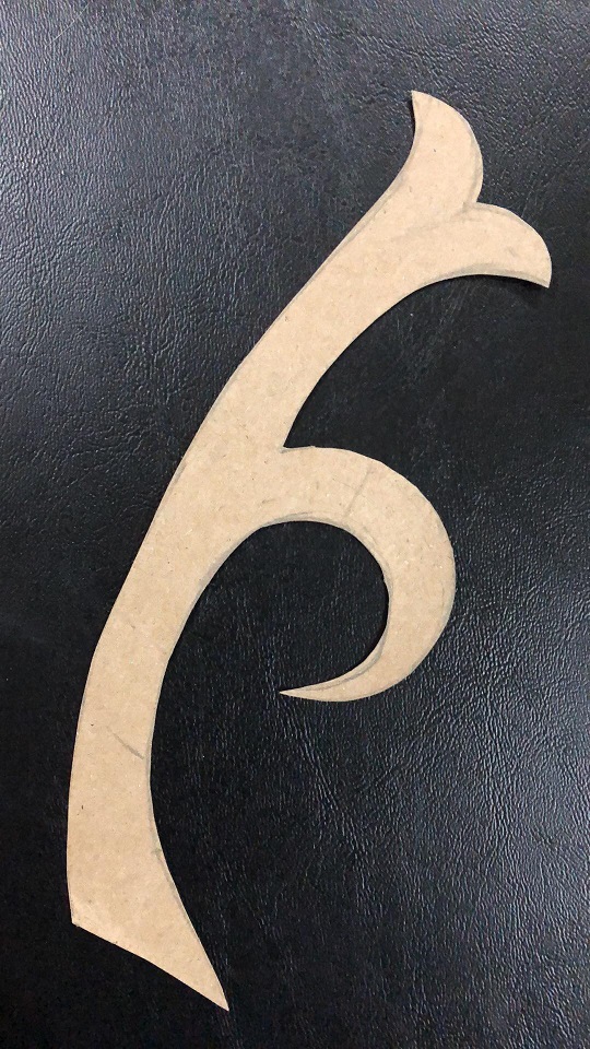
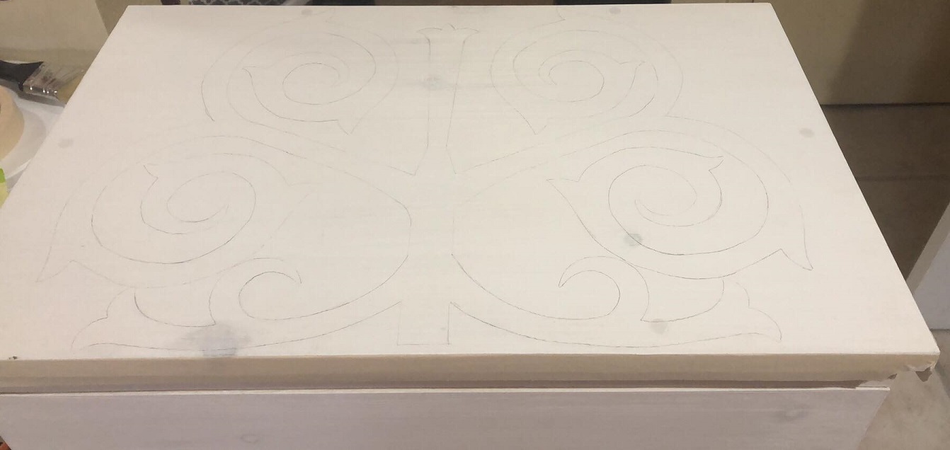
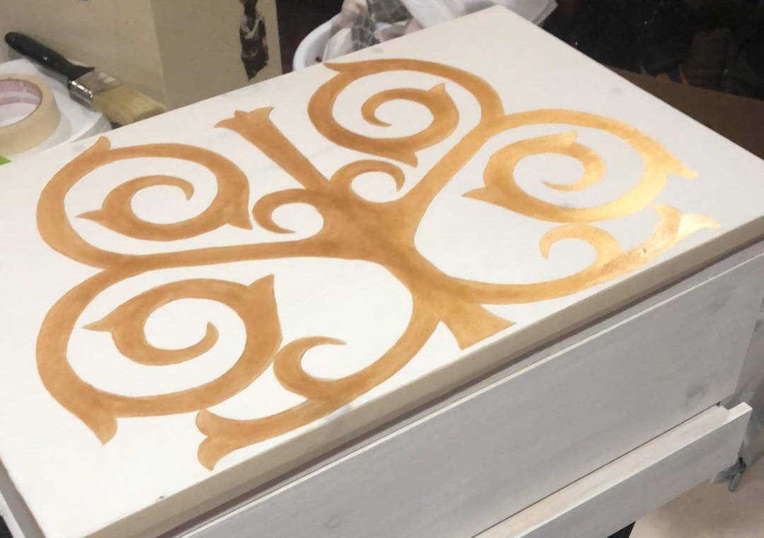
In May 2024 my husband asked me if I could paint a prize box for our friend, Lord Aleksandr Tomasovic, who was fighting his prize fight to advance to rank of Free Scholar within the Academie d’Espee of Atlantia. This is the second box I’ve painted for this purpose.
This time, I chose to paint the box in a style that would match the recipient’s persona. In this case, Aleksandr has a Rus persona, so I chose a style with Russian origins – Mezen wood painting.
I’ll also admit to being a bit selfish here – I really love the look of Mezen folkart. Before I started this project I knew that finding documentation to support it’s existence pre-17th century would be challenging, but I went with this style anyway.
I did eventually find research dating the carving of nature and animal motifs in the Mezen region to the 12th century in Folklore and Folk Art of Russians of the European North (Dmitrieva, 1988, pg 114). The same book also describes how it was common for homes, especially on doors, doorframes, and window frames to be painted with similar symbolism, with historic examples from the 1800s. Based on this information, I find it plausible to extrapolate that this style of wood painting is older than the year 1600, but I was unable to find any documentation of early examples.
This lack of documentation could be for a number of reasons. One of which is that this style of painting was typically used to decorate domestic items of the non-ruling class. These items were typically not a priority for preservation or study. Another reason could be that this painting style was exclusively used on wooden mediums, which also makes pre-17th century preservation a challenge, especially in harsh climates and areas prone to fire. Lastly, we know that Socialist Realism became the only state-sanctioned art style for 60 years (starting in 1932), which led to the destruction of both religious and folk art styles across the Soviet Union (Rohotchenko, et al., 2022).
I also think it’s important to note that while we may not have any evidence of this painting style in period, the symbology used almost certainly goes back to ancient history. A notable example of this type of symbolism can be found in the reindeer depicted in the White Sea Petroglyphs. These petroglyphic reindeer share many stylistic features with the much later Mezen paintings and depict similar scenes.
For anyone interested in the symbology used in Mezen art, this is an interesting site to visit, though it is in Russian so it will need to be translated, but does include additional sources.
A series of barrels painted in the Mezen style. Source.
I didn’t take many progress pictures for this project, but the process was the same as the one used for this box.
In short:
Sand the box smooth.
Coat the entire box with gesso (serves as a basecoat).
Depending on how bright you want the colors, coat the entire box with white acrylic after the gesso has dried.
Go to town with your design!
When finished, use a spray lacquer to protect the paint.
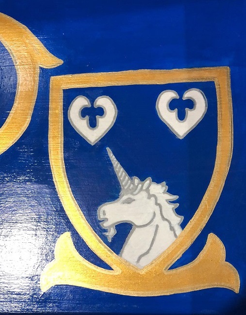
I painted weasels on the front of the box to represent Aleksandr’s heraldry.
The (derpy) cat represents his wife, Signy’s, heraldry.
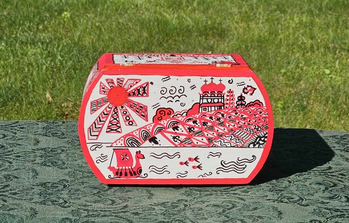
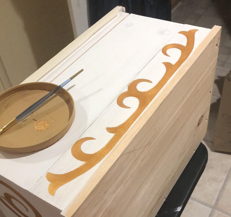
The back of the box.
The bird represents Aleksandr’s son. I asked Signy what animals their son likes and this was one of the options.
The top of the box.
The inside of the box was left plain. The sticker was added by my husband.
Because of the intricacy of this particular style of painting, I used a combination of regular acrylic paint and brushes, acrylic paint pens in various thicknesses, and sharpies.
Overall, I’m quite happy with how this project turned out. It was a fun way to try out a new art style and get a little creative!
References Rohotchenko, et al. (2022). Socialist Realism: An Instrument of Class Struggle in Ukrainian Fine Arts and Architecture. https://philpapers.org/rec/ROHSRA-2
For the Dirty Dozen Largesse competition for King’s Assessment I’ve decided to try my hand at sand casting pewter. Luckily for me, my husband, Baron Cataldo Querini, has been casting for years and was able to provide all of the tools, material, and knowledge that I would need in order to try this -new to me- art.
The parameters of the competition stated that all entries would be donated to the Kingdom. With this in mind, I reached out to Mistress Asta Knarrarbringa, Their Majesties of Atlantia’s Royal Secretary, to ask if there were any award medallions needed. She let me know that they were running low on Golden Dolphin medallions and so I decided that making a dozen for donation would be helpful.
The first step of sand casting is to design a master. The master will then be used for each cast to create the product; the product in this case being twelve Golden Dolphin medallions. Originally, my husband and I started working on a design to 3D print and use as the master. But then I remembered that I already had a Golden Dolphin medallion cast in brass that we could use. Using a pre-existing medallion saved us a lot of time!
My Golden Dolphin medallion that we used as a master.
This Golden Dolphin medallion is a lineage medallion that was originally purchased for Baron Christophe of Grey, then passed to Mistress Lorelei Greenleafe, then passed to Master Stephan Grimm, and then passed to myself. It does include a maker’s mark on the back – a petaled flower – but, despite searching, I could not find the original maker (if someone knows, please tell me so that I can give appropriate credit!). Regardless, I thought that using this medallion as a master would be a way to honor those who have held it in their possession before it came to me.
After deciding on the above, I set to work casting the medallions. The first thing I did was to light the burner to start the process of melting the pewter. Pewter melts at around 338° F depending on the mixture of metals within the pewter, which is a combination of tin and other metals.
Chunks of pewter melting in a steel camp cup.
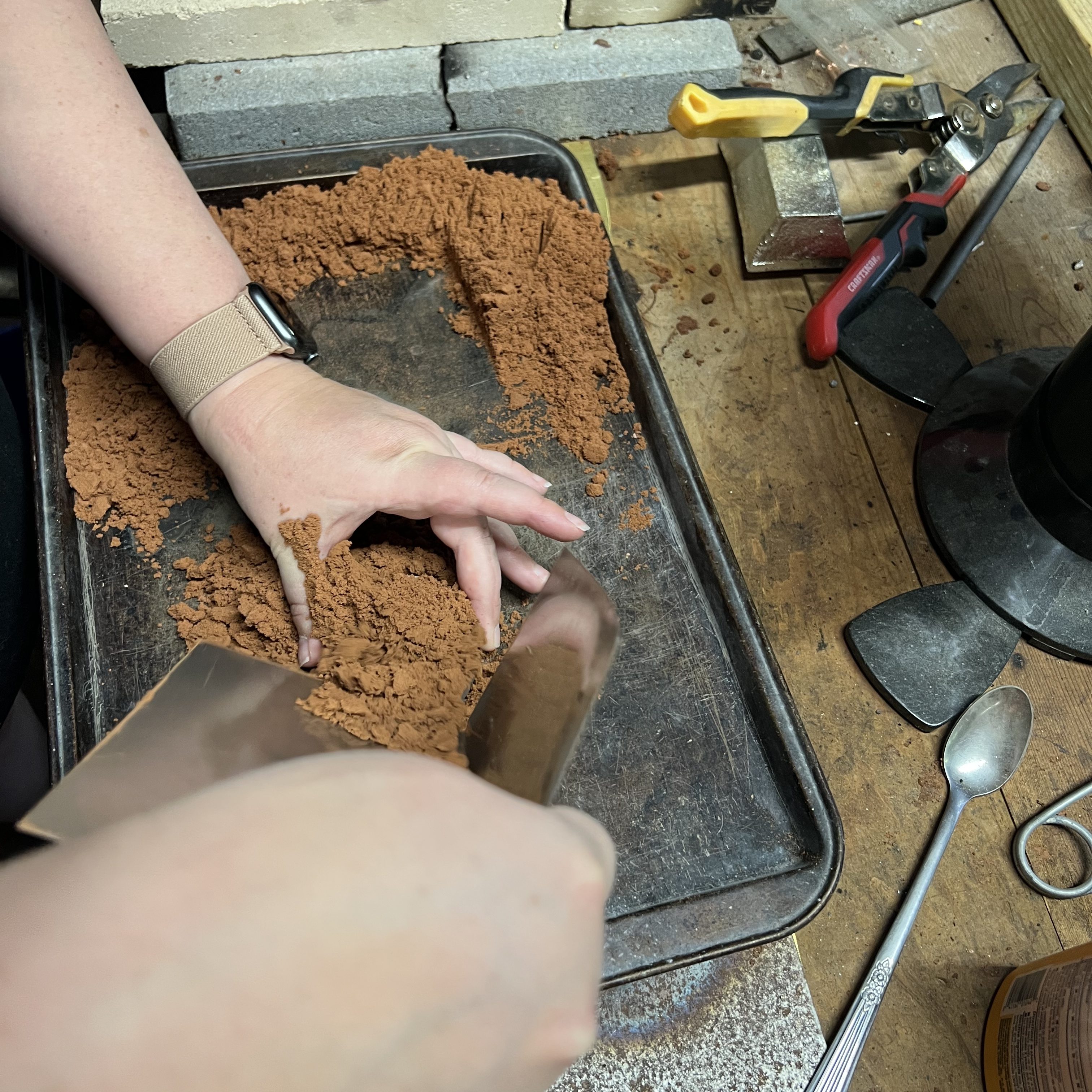
While the pewter was melting I started to pack the sand into aluminum ring molds. For this specific set of molds, the sand is packed first into the smaller ring and tamped down with a hammer, which will be the bottom ring during the pour.
Packing the sand into the ring mold. You can use pretty much any tool to pack the sand. Here I am using a piece of aluminum flashing. This actually works great for packing the sand down, leveling, and scraping it smooth.
This is what it will look like after the sand has been packed into the mold and the excess sand has been leveled and scraped smooth.
After packing the sand into the bottom ring, I pressed the master – face down – into the sand. The master needs to be centered and pressed down so that half is embedded and half is still raised.
Pressing the master into the sand. You can see that the bottom portion of the ring mold must be situated so the lip of the mold is on top.
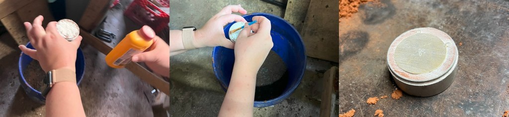
After pressing the master into the sand, I dusted it with a talcum-based powder. The talcum acts as a release to prevent the sand that is packed into the bottom ring from sticking to the sand that will be packed into the top ring. In this project, I used Gold Bond Body Powder for this purpose.
The talcum powder is sprinkled directly on top of the master and the sand, then brushed smooth with a small paint brush. Excess powder can be removed by simply using your breath and blowing it off.
The next step is to put the molds together and fill the other half with sand. The molds need to line up according to the index line (pictured below) and the top half packed the same way the bottom half was packed.
The two halves of the mold need to line up according to these lines. My nails are gross right now – sorry!
After packing the top ring with sand I separate the rings again and created a channel for the pewter in the top ring. The channel was created using a finishing nail. I lined up the nail to the center of top ring, in the middle of the imprint of the back of the medallion, and then pushed the nail through. The channel was smoothed out on the other side using a scrap piece of metal.
Smoothing out the opening of the channel on the top of the top ring. The pewter will be poured directly into this opening.
The last step to smoothly out the channel was to gently press on the opening of both sides with my finger. This helped compact any loose grains of sand in order to prevent them from falling into the pour through the channel.
Then it was time to pour! I put on my thick leather gloves and used steel tongs to grasp the cup holding the pewter.
A puddle of pewter formed on top of the sand, which indicated there was enough to fill the mold and the channel. After that I waited about five minutes for the pewter to harden and cool.
After five minutes, I separated the molds and removed the new pewter medallion.
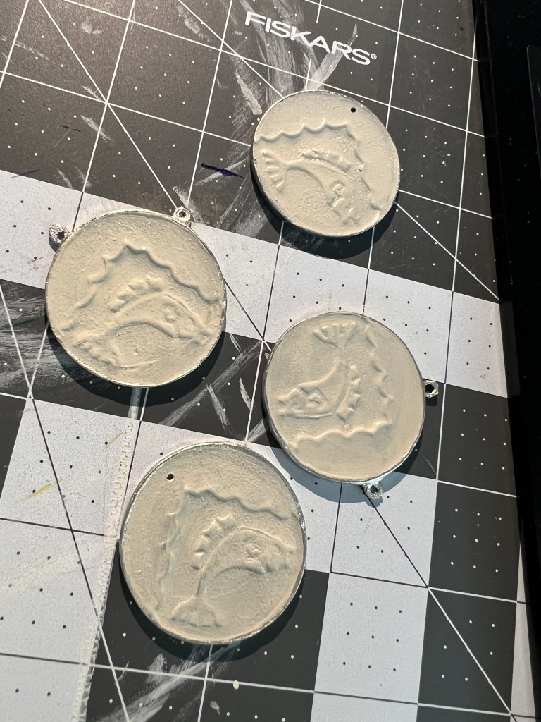
This is what the medallion looks like coming out of the mold. The puddle of pewter is on top, with sand packed around the channel that we created with the nail. The medallion is face down under all that sand.
There was still a lot of sand packed around the channel. That was removed with a spoon and then the medallion was clean up with a small paint brush.
The pewter channel and puddle were removed by clipping the pewter as close to the medallion as possible. And, voila!
The finished medallion.
Now, the repetitive part of casting is having to do this 11 more times! I was able to cast three more medallions before I ran into an issue. While pouring the pewter, the mold started to separate and the pewter leaked out of the side.
Oops.
At first I thought I had failed to press the molds together properly and there was a gap at the seam. But it happened again, even after I had double and triple checked that the molds were fitted together tightly. My husband theorized that I might be packing the sand too tightly and there was nowhere for the hot air to escape – potentially creating an air bubble that was forcing the molds apart. We tried again, this time creating additional channels outside of the shape of the medallion in the mold and along the edge of the rings. Unfortunately that didn’t work either and it happened for a third time!
The fourth time my husband tried it for himself and it still failed. At that point we decided to take a break because we were getting frustrated. Later in the evening my husband tried a few more times and the cast failed each time. We decided that the molds themselves might be weaking from age and use (they have been in use for a few years) so we placed an order for a new set.
So for now I have four finished medallions and will have to make the last eight when the new molds arrive.
The final step in casting was the medallions to be cleaned and buffed. My husband was kind enough to do this part of the process for me. He used an 80 grit flap-wheel on his bench grinder and a 220 grit wheel on his angle grinder to give the backs a light polish. I’ll learn and use the bench grinder on the next batch. On some of the medallions we decided to drill a hole in the center using a drill press… add that to my list of tools to learn about!
The finished medallions before painting.
According to Dress Accessories 1150-1450, many lead alloy brooches would have been painted in period (Egan and Pritchard, 1991, pg 261). In keeping with this, I wanted to paint the medallions I had made. I used a variety of brushes in different sizes and model paints for this process.
The paints that I used in the order that I used them.
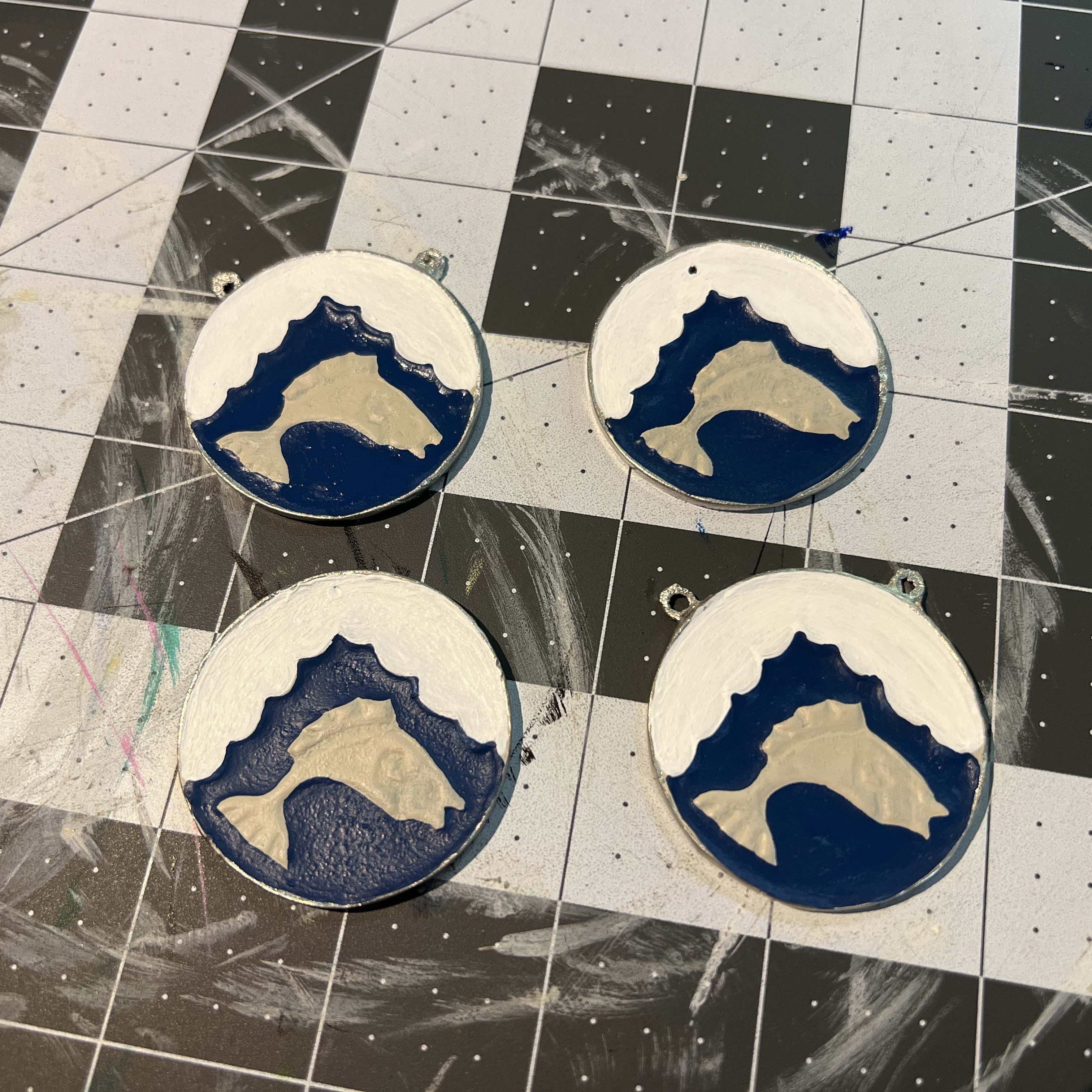
I started by painted the entire front of the medallions with a base coat in “Wraithbone”.
Painted base coat.
Next, I painted the white. White is a difficult color to paint due to the size of the pigment. I ended up painting four layers – thinned with water – in order to get the coverage that I wanted.
Painting the white.
After the four coats of white, I painted the blue. The coverage of this blue was fantastic. I only needed one coat and then some minor touch ups after drying.
The white and the blue.
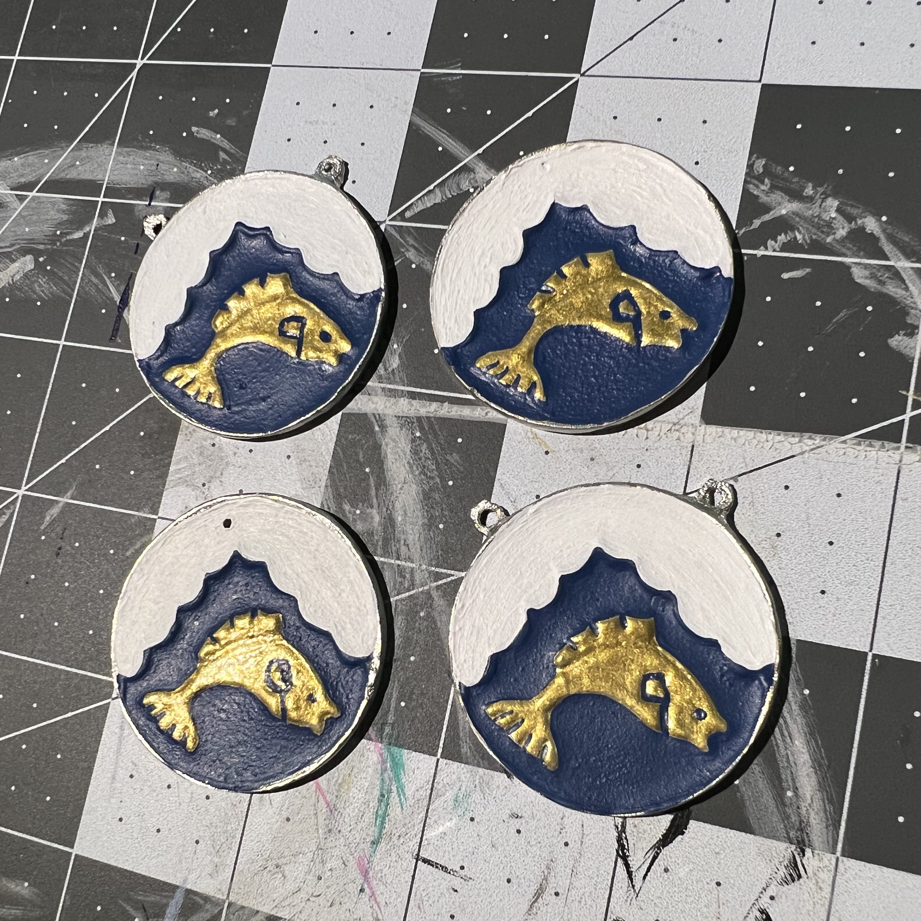
Next I painted the dolphin gold. The gold paint was very thin! I ended up more or less blobbing it on there with the brush rather than paint a million layers and it actually turned out looking very cool.
The gold ended up looking raised, almost like a second layer of brass.
For the last step of the painting process I went through with a teensy tiny brush and cleaned up the outlines with the blue and added the details to the dolphin.
Painting complete!
I allowed the paint to dry for over 12 hours. To seal the paint, I sprayed the medallions with a Krylon brand lacquer. This will help prevent the paint from chipping and protect the finish.
After a coat of lacquer and an hour to dry.
The final step of this project will be to affix a jump ring so that a medallion cord can be attached as needed.
I am very pleased with how these medallions turned out! The new ring molds should be delivered in the next two weeks so I can finish the project then. What do you think? Let me know in the comments!
UPDATE: After the new casting rings were delivered I was able to successfully cast the remaining medallions, paint them, and enter them into the Dirty Dozen Largesse competition at King’s Assessment on July 8, 2023. I won!
In early October my husband asked me if I could paint a prize box for our friend, Lord Matthew of Norfolk, who was fighting his prize fight to advance to rank of Free Scholar within the Academie d’Espee of Atlantia.
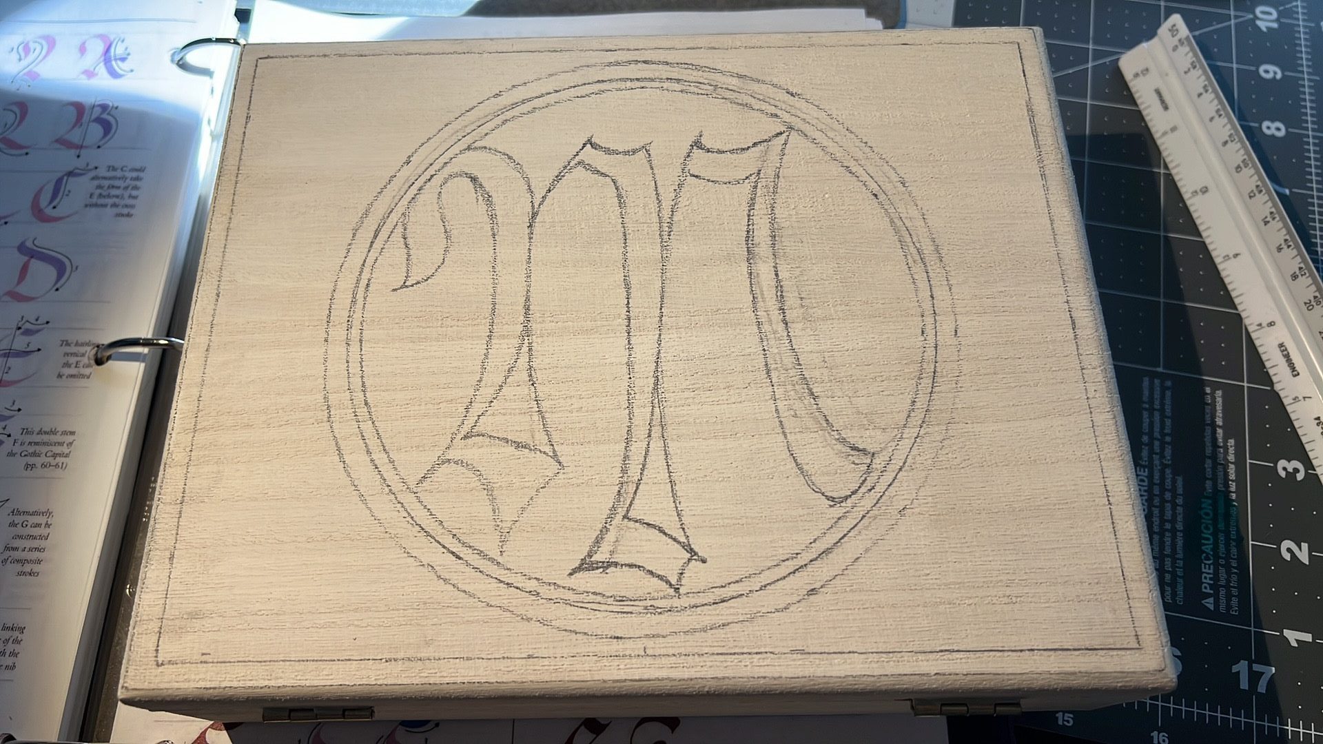
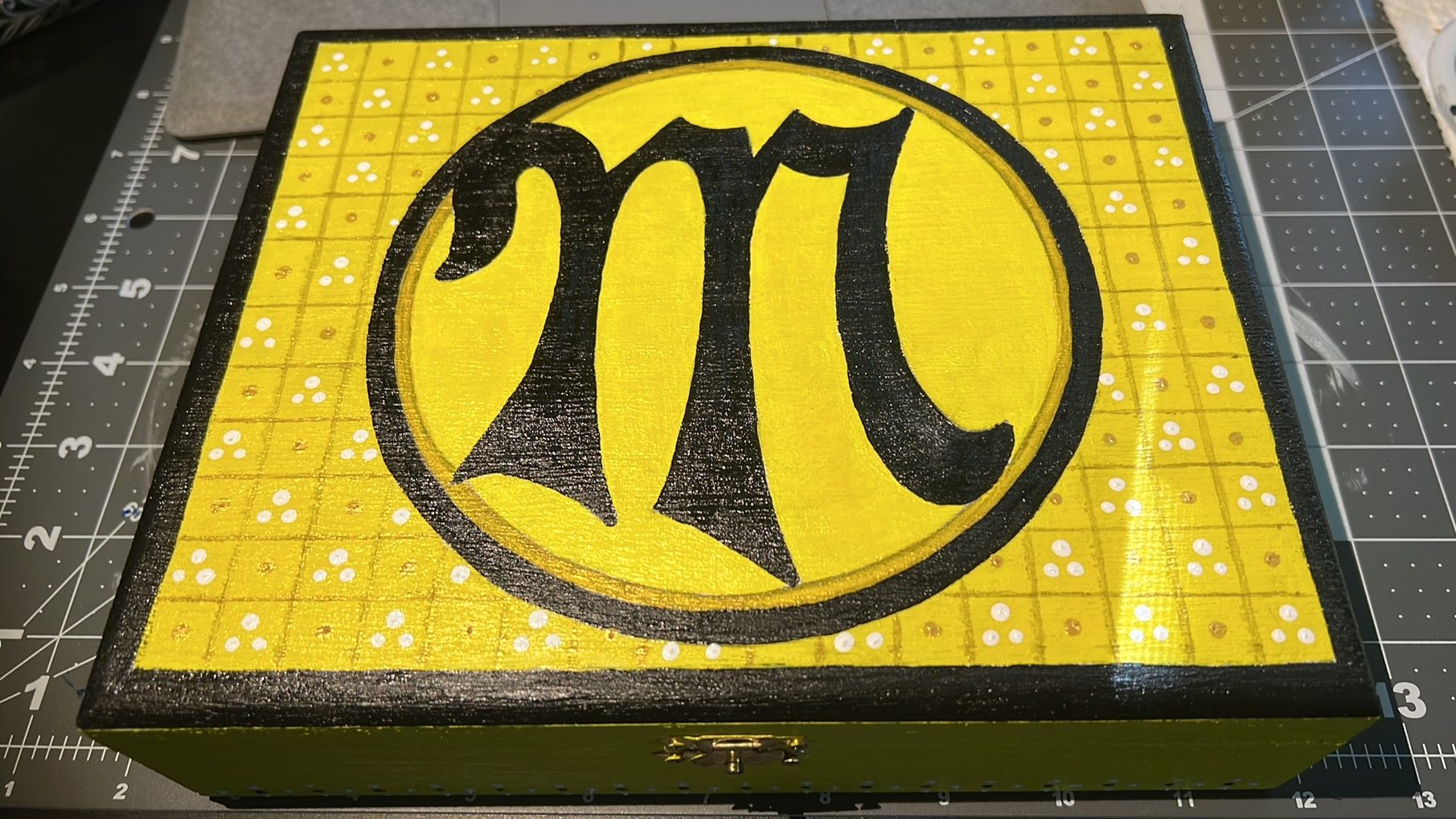
Even though I don’t have any advanced skills in regard to shading or dimension, I really enjoy painting so I was happy to do it. I surfed Pinterest for some inspo pics and settled on a design that would feature the letter “M” – for Matthew – and the colors yellow and black – for his heraldic device.
I started by creating a stencil for the letter M. I used The Art of Calligraphy: A Practical Guide to the Skills and Techniques by David Harris to choose a script that I liked.
The letter M from the script Bastard Capitals.
I just used a pencil and plain white paper to create the stencil.
After my husband sanded the box smooth, I drew the design I wanted in pencil on the lid of the box. Then I covered the entire box with acrylic gesso. Gesso provides a base layer that will prevent acrylic paints (which are water based) from absorbing directly into the wood and help keep pigments bright.
Basic design for the box.
One thing that I’ve had to incorporate into painting is good time management! It’s important to plan well so that there is plenty of time for the layers of paint to set and dry properly. I like to err on the side of caution and allow 12-24 hours between layers.
After allowing the gesso to dry I went in with yellow acrylic, which covered the majority of the box. Another thing that I’ve learned about painting – and from my husband, who has way more time and experience with painting than I do – is that some colors are more finicky than others. Yellow and white are especially difficult because the pigmentation is very thin. These colors can often be streaky and require more layers.
Yellow and white acrylic.
After painting an initial layer of yellow, I decide to go in with a base of white acrylic inside of the circle (seen above) in order to make the yellow there pop a bit more. The first layer just looked a bit too drab and flat. In retrospect, I wish I would have put down a layer of white acrylic first everywhere on the box that I planned to paint yellow.
Next, I painted part of the circle and the letter “M” black and added some black trim to the edge of the box.
I used some of my husband’s Tamiya model masking tape to get clean lines on the edge of the box. You can really see the difference in the yellow within the circle (where I put a base of white acrylic) and outside of the circle (where I just painted the yellow directly over the gesso).
Next, I created a grid on the lid of the box painting along the edge of a ruler.
The lines are not perfect but that’s okay!
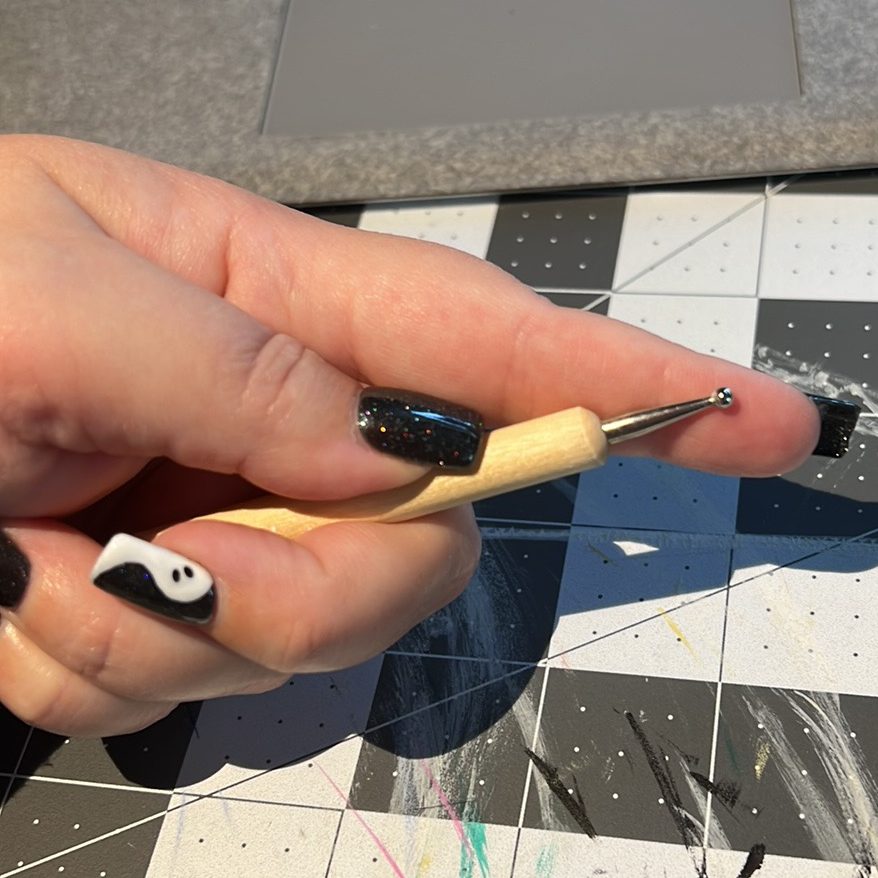
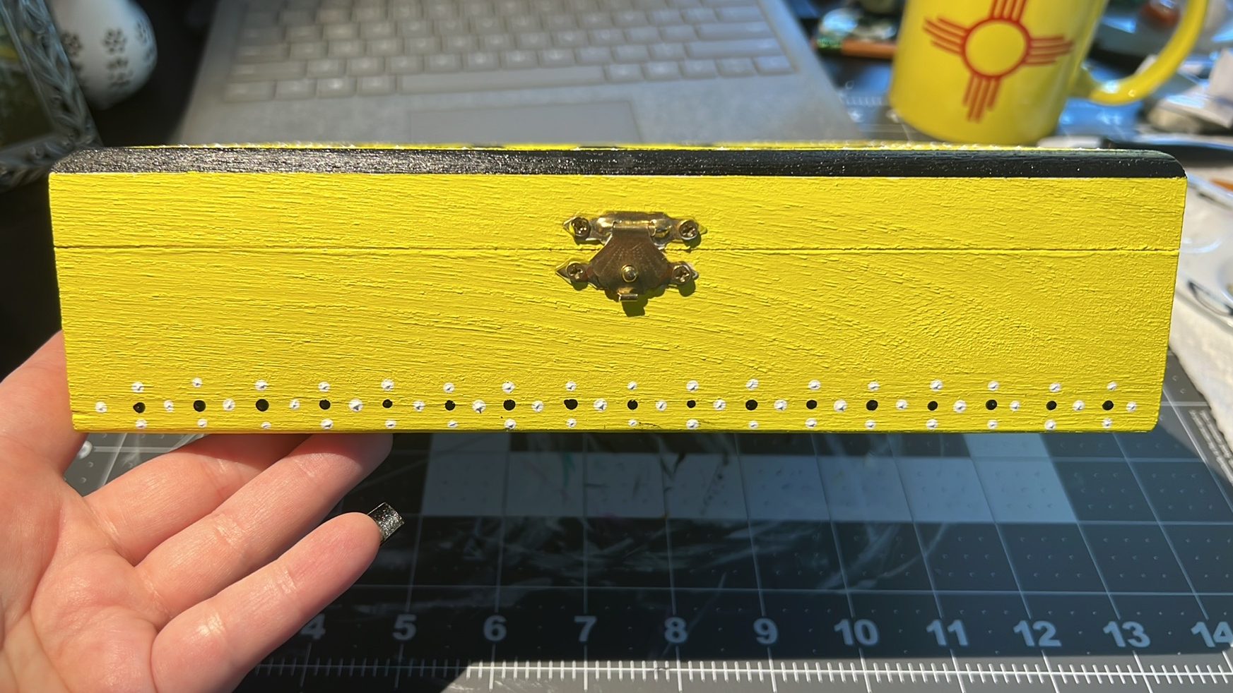
I then took a dotting tool/ball stylus and created a design in black, white, and gold acrylic on the lid and along the bottom edge of the box.
Size of the dotting tool/finger for scale.
Dot design along the bottom edge of the box.
Dot design on the lid of the box.
The last element I added was some diagonal lines with the gold dots using a small, angled brush.
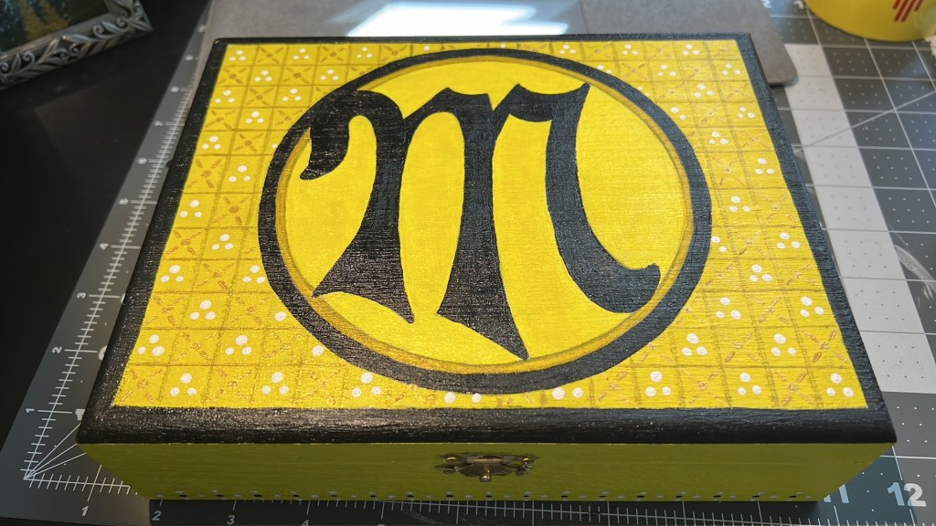
Voila! Box complete!
The last step of any painted box is to seal it in order to protect the paint and add some shine. I used a high gloss spray lacquer from Krylon .
I really enjoyed this little project. Painted boxes are a fun way to enhance gifts and add to the background/ambience of events and ceremonies in the SCA.
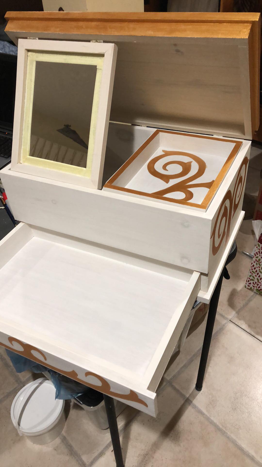
In November of 2017, I began the first steps towards forming a student-teacher relationship with Her then Excellency, now Princess Adelhait Fuchs. Her Highness and I agreed to a trial-period of at least one year before we would formalize our relationship with a contract. In 2018 we agreed that we felt our relationship to be a good fit and so we began making preparations for my Companion Ceremony.
While there are variations of student-teacher ceremonies throughout the Knowne World, there are some traditions that seem to be most common. In addition to the tradition of a contract and the gifting of a belt or favor, there are often gifts exchanged between student and teacher. When planning for the ceremony began, I started to brainstorm a list of potential gifts for Her Excellency based on what I knew regarding her whims and preferences.
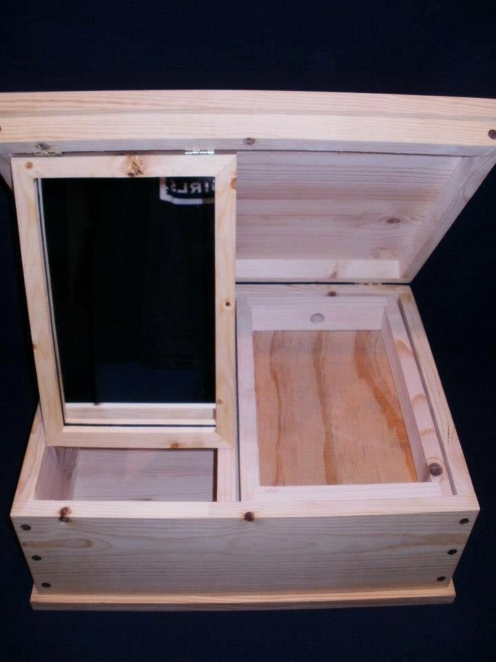
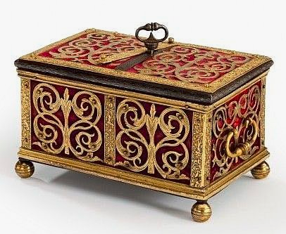
I came up with many ideas, but the one that seemed to stick was the idea of a painted jewelry box. This idea was originally inspired by Dame Emma West, who painted a mirror box in the style of a reliquary box from the Uppsala Cathedral, dated from the 12th century. Her Highness, Princess Adelhait, is well known for her love of shiny things – jewelry and accessories – so I knew this would be a gift that she would both appreciate and find useful.
Originally I planned to paint a mirror box that I had purchased previously at Fool’s War in 2017. However, at Pennsic 2018, Her Highness’s husband Count Christoph purchased her a larger mirror box from Egill’s Woodstuffs and offered it to me to paint instead.
Before I began any work on the box, I sent a message to Dame Emma and asked her what steps she took in painting her box, what supplies she used, etc. She was incredibly helpful – as always – and so I followed her instructions exactly.
Next, I had to decide on a design that I wanted to use. For this step, I mostly browsed Pinterest since documentation was not of vital importance. I mainly needed visual inspiration and found plenty of examples under a search for “reliquary box”. I finally decided on the following design as inspiration since Her Highness’s persona is late period German.
The Pinterest caption read: “South German Jewel Casket, Nuremburg or Augsburg, c.1600”
After deciding on a design, I gathered my list of supplies and went to Michael’s to buy everything that I would need. I used very basic supplies for this project – nothing fancy – since this was my first time painting a box, a lot of the process would be trial and error. The first step was to gesso the entirety of the box. Gesso provides a white base layer so that the colored paints are not muted by the wood.
I bought a large tub of gesso because I knew I would use this for other projects.
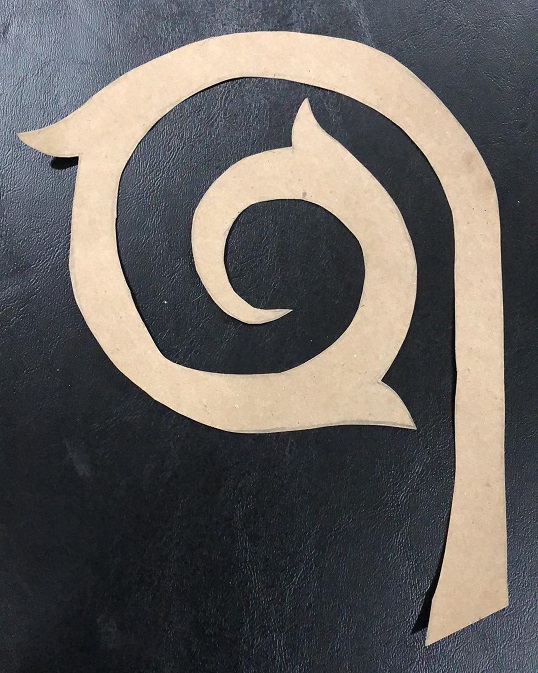
After painting the box with two layers of gesso, I decided to make stencils for my design. I love working with stencils – I use them for my fabric painting as well – because they allow for a precision in design that is rarely achieved when drawing or painting free-hand. I came up with two stencils that I used in various combinations on different sides of the box. These stencils were drawn by tracing a variety of circular shaped objects on a brown, paper grocery bag. Very fancy 😉
Stencil #1
Stencil #2
I spent a lot of time visualizing how I wanted the stencils to be arranged in order to get the design that I wanted. But once that lengthy process was complete, I started to trace the stencils directly on to the box using a regular pencil.
The lid of the box after two layers of gesso and the traced design. It is very faint, but you can make out the pencil markings.
One the design was traced, I started to paint. Based on the box that I chose as my inspiration, I chose to work with only three colors.
I decided on these paints since blue and white are Her Excellency’s colors and the box that I used for inspiration was worked in gold.
I bought a very basic set of brushes to use for acrylic paints in a variety of sizes.
I started painting the gold first. I figured that if I went “outside the lines” with the gold, that would easily be covered by the blue. Covering blue with gold would not be as easy a task.
The first layer of gold paint.
Once I started to paint the gold I realized that I was going to need multiple layers. You can see in the picture above how light the gold color was initially and how streaky the paint started with that first layer. In the end, I had to paint four layers of gold in order to get the color that I wanted to achieve.
Second layer. Still very light and streaky.
Third layer. Almost there!
Luckily, acrylic paint dries relatively quickly so it can be layered easily without large amounts of time spent wasted while waiting for paint to dry.
Drawer design featuring my very fancy coffee lid paint pallet.
The inside of the box, with some of the trim painted gold.
Eventually I did need to work in time to allow the paint to dry – this ended up being the trickiest bit. I really had to plan out what sides of the box I could paint and allow to dry, while still being able to work on other parts of the box. The box also had to be flipped and laid on its side to be painted more easily, so that had to be factored in as well. In the end, I came up with a very rigid schedule of which sides I could paint when – in order to allow time for the paint to dry in between layers and the box being laid on one side or the other. This became especially important when I began to paint the remainder of the box blue.
The first part of the box to be painted blue was the removable box that sits inside of the top layer, to the right of the mirror. This smaller box was my test piece for the blue paint, and I’m very glad that I was smart enough to do it this way, because the blue paint turned out to be very disappointing.
This blue paint was terrible on its own.
You can see in the picture above that the blue paint was quite streaky. It was also much thicker and darker than the gold paint, not allowing for layers in the same way. I’ll admit, I had a bit of a panic attack when I first used the blue paint. The gold had layered so well and then the blue looked awful! I reached out to a few friends with more painting experience, in addition to searching the internet for a solution. One specific solution that I found online suggested adding Titanium White as a semi-opaque. Luckily this was the exact color that I bought at Michael’s. I added a dollop of Titanium White to Disappointing Blue and it worked like a charm!
The end result of mixing the white and blue. A bit lighter, but still a true blue. Nice and matte – no streaks!
I was very happy with how the blue turned out and it only required two layers, as opposed to the four layers I had to paint with the gold color.
A progress picture of the blue going on the top of the box.
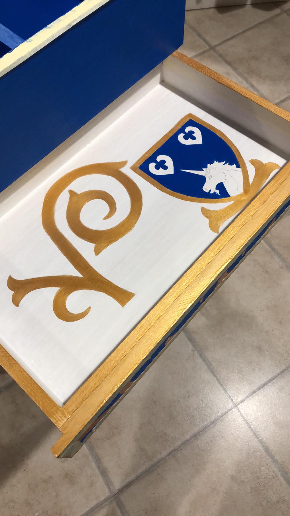
In order to personalize the box for Her Highness, I added her device to the inside of the bottom drawer.
Her Highness’s device drawn in pencil.
The bottom drawer in its entirety.
The bottom drawer after painting.
Progress! You can see in this picture how I used masking tape along the edges to make painting the trim easier.
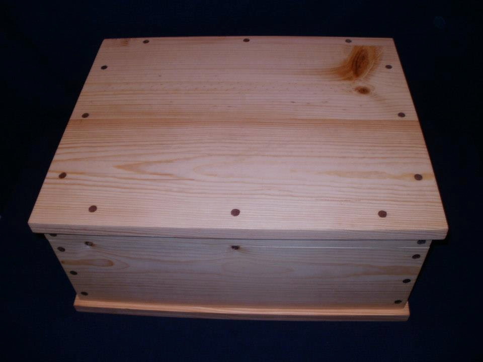
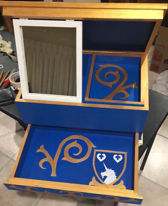
Painting is done! Here is the final view of the inside.
Final view of the outside.
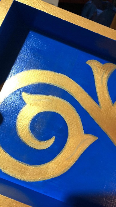
Once painting was complete, I used a paint pen to outline the gold motifs and add a bit of detailing. This cleaned up the line that was painted by brush.
You can see the slightly darker gold outline here, with some additional detailing inside the gold motif.
Paint pen.
After the outline and detailing was done, it was time to lacquer the box. This was a trial in itself. For the first attempt at lacquering, I purchased a can of liquid lacquer from Home Depot and attempted to apply it in strokes using a foam brush. This did not work well. It was difficult to regulate the amount of lacquer on the brush and the strokes were very visible to me. It was especially hard to apply inside the box, with the smaller sides and corners.
The streaks of lacquer are quite visible here.
The liquid lacquer also caused a bit of a panic when I applied it to the bottom drawer over Sharpie, which I had used to outline the device, and it streaked horribly. I would never have guessed that lacquer could smear “permanent marker” but it does. Lesson learned!
I may have had a mild meltdown when this happened.
When I saw the Sharpie start to streak, I set down the lacquer and stepped away for the night. The next morning I attempted to fix the streaking by painting over the first layer of lacquer. I am quite certain this is some kind of no-no in the world of painting wood, but I knew I would be applying another coat of lacquer later and it was the only way I could try and fix the problem that the lacquer had created.
I used a small, white paint pen to cover up the silver streaks and also repainted with blue as needed. Not perfect, but I’m happy with the fix.
After the Sharpie incident, I opted to go back to the store, purchase spray lacquer, and try that instead. Not only did it work much better, but it dried much more quickly and I was able to apply 2-3 coats, finishing the box nicely.
The final step was to add some words to the mirror. I had a friend translate Her Highness’s favorite quote from Mean Girls (a favorite movie of ours) into Latin: “You’re really pretty! So you agree, you think you’re really pretty?” – “Tu ed pulcherrima! Tum adsentis, tu putas te pulcherrimam esse?” I then used the gold paint pen to write this on the edge of the mirror. This definitely could have turned out better – I wish I had a smaller, gold paint pen to use, but I was unfortunately out of time and the lacquer incident had taken more time to resolve, leaving less time for this detail.
The lettering with my grumpy reflection.
I applied a final coat of lacquer and then I was done!
I presented the box to Her Highness at Atlantia’s 12th Night event on January 12th.
Presenting the box to Her Highness.
Overall, I am very happy with how this project turned out. From start to finish, it took about two months to complete, though I was not working on it every day. It was my first time painting wood like this and while it wasn’t perfect, I managed to work around and fix most of the complications and mistakes that came up. It was a great learning experience and I already know how best to tackle another project like this in the future!
I was first introduced to fabric painting by Her Excellency, Countess Brigit of Mercia, at an Atlantian University. Since then I’ve become quite enamored with the idea of painting designs on fabric for use on garb, accessories, largesse, and more. It can be quicker and more precise than embroidery, another passion of mine for which I rarely (unfortunately) have time. Below are some projects that I’ve completed using fabric painting methods.
The Virtue of Chastity
The inspiration for the final dress. A painting of Laura de Noves Crowning Petrarch. 15th c. Laurentian Library, Florence, Italy
The theme for Spring Coronation 2017 was Vices and Virtues. After being selected as a “team captain” for the Virtue of Chastity, I decided to make a dress based on the writings of the Italian scholar, Petrarch. The final vision for the dress was based on the 15th century painting of Laura de Noves Crowning Petrarch, housed in the Laurentian Library in Florence, Italy. I dressed as Laura de Noves, wearing an Italian cottardita with affrappata (dags), painted by hand with fleur-de-lis or flower of the lily – a traditional symbol of Chastity. My friend, Vadoma, dressed as Petrarch, wearing an Italian mantello, giornea, and hood.
Petrarch, a 14th century Italian scholar and poet known for the Rerum Memorandarum Libri, wrote his work of prose in order to celebrate the cardinal virtues – including the Triumph of Chastity. It is a combination of this work, Petrarch’s Triumph of Chastity, and his personal relationship with Laura de Noves that inspired these garments. The figure of Laura de Noves in the attached painting is the personification of Chastity, crowning the Poet with a wreath of Laurels. For the event, we used a wreath of lilies – as, again, a traditional symbol of Chastity.
A progress picture of the fabric being painted. I used a stencil and gold acrylic paint. If I were to make the garment again, I would have cut the pattern for the dress first and then fit the stencil to the pattern, rather than attempting to mimic the look of block-printed fabric by the bolt.
The finished garment, with Vadoma and I attempting to recreate the pose from the original painting.
A less serious pose!
Largesse
One my favorite uses for fabric painting is in making items of largesse – for donation to the Kingdom and various Baronies or other local groups. Again, I find that stencils are often the quickest and most precise way to create intricate designs for pouches, chalice covers, fans, or similar items made in bulk.
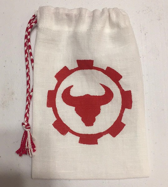
A dozen of these pouches were made and donated to the Barony of Stierbach in 2018. The stencil was made by hand, inspired by the Barony’s populace badge. I used red acrylic paint on white linen. I also finger-loop braided the drawstrings using DMC Pearl Cotton.
A dozen of these pouches were made and donated to the Kingdom of Atlantia in 2017 at Pennsic. The stencil was purchased, inspired by our Kingdom’s populace badge. I used blue acrylic paint on white linen. I also finger-loop braided the drawstrings using DMC Pearl Cotton.
Progress pictures from the fabric painting of the Kingdom pouches. I’m a big fan of assembly lines!
A dozen of these chalice covers were made and donated to the Kingdom of Atlantia in 2017 at Pennsic. The stencil was purchased, inspired by our Kingdom’s nautical themed imagery. I used blue acrylic paint on white linen.
Teaching
Since becoming more comfortable with the art of fabric painting, I’ve taken steps to spread the love by teaching classes at both Atlantia University and Pennsic.
So far I’ve taught “Make & Take a Fabric-Painted Pouch” at both Atlantia’s Summer University, June 16, 2018 and Pennsic University, August 3, 2018.
I look forward to strengthening my painting skills even further and teaching another class when the opportunity arises!


